Monday, March 30, 2009

Daijiro Mizuno - Rationalizing Intuition


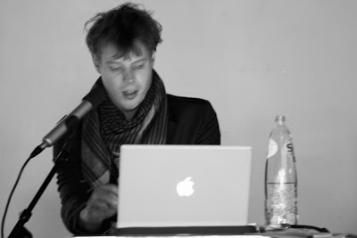
Daijiro Mizuno and Bas Rajmakkers
Photograph by Susana Camara

Article by Carolina dos Santos Reis

Young PhD Daijiro Mizuno took us on a journey through his work and views on design during his presentation last Friday, 27 March in the Design Academy auditorium. Unlike most of our lecturers that are active designers designing commercial products, he distinguishes himself by focusing his investigation on the act of designing itself. He surprised us with new and different perspectives showing us how all components of the creative process overlap.

If I were to describe Mizuno in three words, they would be passionate, curious and playful – all qualities a designer needs to pursue studies at the higher level and dedicate his career to research. Although Mizuno feels there is no difference between Japanese and Western design anymore, he is influenced by his environment. Since he is now spending most of his time in Japan, his Paperbag Girls project was an installation showcasing the phenomenon of Japanese women who collect branded paper bags, carrying them as a secondary bag carefully matched to their outfit. Even if this is very particular of the nippon society where fascination and addiction to brands is at it’s strongest expression, it happens also in other countries. Mizuno’s interest goes beyond the local cultural definitions. He would rather elaborate on why and how this represents new Zeitgeist as a contemporary form of consumption. This project was inspired on the theories of Bourdieu and Foucault, on accumulated photographic data and influenced his students to create new paperbags. What emerges from this study is how ideas are interwoven between theory, research and practice.

In his professional discourse, Mizuno cites issues like identity, ethics, sociology, history, economics, and psychology, among others, to understand fashion. But his main interest is the irrational dimension present in fashion. For instance, when he studied Universal Fashion Design, that is, garments specially designed for physically impaired persons, he questioned why they were so dull and unattractive, and why it is so important for fashion to offer irrational matters as a social object related to identity. This led him to develop a collection of clothing based on analyzing the physical limitations of the disabled and the kinetics of the body. While the resulting pieces looked like ordinary garments, they had hidden details that facilitated mobility.

Mizuno’s fascination about how designers make sense of themselves led him to focus on the mechanisms of the design process and its inspirational sources for his PhD thesis. When he worked as a part time assistant for Shelley Fox, he became very intrigued with the creative process and how the formal outcome emerges. This motivated him to study the mechanisms of the process more deeply, by both examining other designers and his own method. He stresses intuitive properties in the development of design and the importance of synaesthetics in the outcome of creations. His investigation was based on the concept of orality by Walter J. Ong, to find the traces of tangible shapes hidden in the language and expression of fashion. To cite Mizuno’words, he “applied "Orality" as a means to analyse the psychodynamics of designers represented as clothing design. It can mean shapes of collars etc..., although it can be problematic to analyse clothing in linguistic manner”. Moreover, he used the theories of Seigo Matsuoka, an editorial engineer, to critically reflect on how ideas arise. According to Matsuoka, the world is composed of a sum of information and the idea is the synthesis of this; this is where intuitive enlightenment begins. To better explain his investigation, Mizuno assembled diagrams to help us visualise the links between all parts, and to identify clusters and reoccurring patterns.

Another project he is working on is Belonging and Belongings with STBY, a social research service for design innovation. It examines identity through different means and how style is associated to location; in other words, how a context can alter what is communicated by a subject, and conversely, how a subject can influence the perception of a place.
What arose is that the most common objects of daily use, like clothing, often encompass the most complex considerations, including social matters like identity, communication and moral values. Maybe it was the richness of this content, touching on such intricate, abstract and diverse subjects, that made us seem somewhat perplexed at the end of the presentation. Maybe it was the hidden theme of his lecture, as he later explained to me, that challenged our own preconceived notions - to demonstrate how theory, research and practice can be incorporated without conflicts.


The lecture would not have been complete without the workshop introduced by Bas Rajmakkers that followed. The students of the Man & Humanity Master programme were able to reflect on and discuss their own creative and research processes using a diagram based on Mastuoka’s concepts. In this way, Mizuno shared a part of his work in a more practical context, which gave us a better understanding to what intuition is linked in our personal research patterns.


Diagram used in the workshop to analyze our personal research process


Wednesday, March 18, 2009

Resumè of the interview:Kiki van Eijk & Joost van Bleiswijk


Written by Maurizio Montalti


On march 4th we had the possibility to conduct an interview with two well-known dutch designers: Kiki van Eijk and Joost van Bleiswijk.


The interview started with an investigation for a better understanding of their perception of “time”, a subject strongly present and recognizable in most of their works. What emerged is a vision of time as something not very strict, but something that still exists and that’s reflected, for instance, in the time consuming pieces that are a result of the accurate polishing process in Joost’s work. At the same time he was highlighting how the past is still the present , and this can be found in the archetypes , where the concept of time does not exist anymore.


For Kiki, instead, time equals quality, time is life itself and it’s about enjoying things around you, referring to very personal things . Afterwards, Joost pointed out how his interest in architectural forms and construction methods, born from the experience in working and the curiosity of discovering elements, became a strong inspiration for his work. Initially he started highlighting the relevance of the translation of the round shaped feminine profiles into strong masculine representations, based on edges and squares, but when we tried to understand better this difference between masculine and feminine design he said that there’s not this big gap; it’s just something emotional and subtle.


Kiki, differently, was adressed with a question about the value of memory in her works, something she said is not really there; she described her designs as something much more related with quality and real craftmanship, objects not only functional but that also contain, in the way they are looking, an emotional feeling, like she found out in some books about old tools.
She said her inspiration comes out by itself, she’s never looking for it...it just happens...all of a sudden you open a drawer and there is something, asking her to create something with it; it’s an intuitive process, that she tries to lead to the creation of something very pure, helped by the unconscious active experience in materials and technology.


Then we came to talk about the influence and the relevance of Dutch Design in the past and in the “now” and they talked proudly about how Dutch Design had improved the world of design in general, even if nowadays it doesn’t really matter anymore; indeed sometimes it’s also becoming “bad” being dutch, as it is often associated with a marketing tool.


Talking about the educational system in The Netherlands, they were appreciating it a lot , and in particular they were underlining how the “Design Academy”, where they also studied previously offers a very good combination of a vague, “arty” approach and of the structured goal of education: in a way it’s an environment in which you’re always “forced” to go in depth, research, find what fascinates yourself...and explore yourself, find out the best for you as a person; that’s the main distinguishing carachteristic from any other institution, they said, the overall mentality...;and the fact that the academy is specialized in design...and just that.


When we came to talk about the design industry and the topic of “limited editions “, connected with the actual economic crisis , they pointed out how this phenomenon is not always “honest”.
They said that “limited editions” are there for a reason: they respond to the request for an expensive product in terms of time and materials. They said it wouldn’t be fair for the collectors to make endlessly pieces when they cost a lot...


At the same time some people are using these phenomenon as a tool to make more money, so that it becomes a trend, just by changing colors or materials of previous popular designs and increasing the price. They forecasted that these people and companies are gonna disappear, faced with this crisis, but the “Limited Editions” reality will still be there in its autenticity: things made by hand, attention to the detail and expansive materials and processes. They consider limited editions as an investment as they did it for quite years; and because of this there’s a value; because there’s a range of evolution over the years; it’s a keep-on-growing process.


Afterwards we talked a bit about Milan, adressing them with a question about their prevision on this year’s “Salone del Mobile” edition; they see the possibility of having something a bit less extravagant; they also decided not to have a solo show this year; they will only present projects they made for labels. And what they predict is that probably many designers will do like that.
Kiki was saying that this is because a solo show has to be at least at the same level of the previous one and to do so it needs time to develop a collection and also, because maybe there are more appropriate platforms for showing these kind of “limited edition” collections, like, for instance, “Design Miami/Basel”. Besides Joost said that it’s not necessary anymore for them to show their works in the popular Salone’s windows as they already know the press agents and the gallerists and they are not anymore in need of promotion and publicity. But never say never; it’s always a big fun to make a good show for a collection.


We ended the interview with a light question about the connection between food and design, something relevant for Kiki, that is also art director of “De Witte Tafel”, a resturant placed in the basement of the same building, in which the Design Academy is placed: for her working with food and design is just an interest, an opportunity that came out after her graduation and that she decided to develop, adressing it in the exactly same way she designs...creating connections, transparent visual feelings and fresh atmospheres. They both were very kind and warm. It’s been a pleasure.

Editorial article: Kiki van Eijk & Joost van Bleiswijk


Written by Michael Leung


Kiki van Eijk and Joost van Bleiswijk started with a photo of themselves in a workshop, both dressed up. In the picture, Kiki was leaning against her ‘High Table’ made with powder coated steel and Joost standing beside her, both staring a trophy in the ‘No Screw No glue’ series Joost had made for himself as he wanted one but have received none so far, he said. Kiki and Joost are known as part of the new generation talented Dutch designers. They graduated from Design Academy Eindhoven and started their studio since. Kiki is working on her own projects which have been exhibiting in many places and also work on projects for brands such as Swarovski and Moooi. Joost have been working mainly on his own projects like the ‘No Screw No glue’ series.


“Hands on” as the theme of the lecture, Joost explained how they set up the new studio in Strijp-s and showed us the before and after pictures. Like the theme, they prefer to really get their hands on making things, from their studio to their design, even the snacks in their exhibitions. They believe it is the way to design, really get your hands on to it. It’s also a reason that most of the works shown are limited editions. Like the first few pieces in the ‘No Screw No glue’. The material used is plywood, not the most precious or valuable material, but Joost said the time and effort they had to spend on it makes the difference. Also with the later pieces, which is made with stainless steel sheets that are laser cut and then polished and hand assembled. Another reason for making the limited editions is that they have to worry less about the production costs. It is also a way to protect their client since they believe it is not reasonable if someone paid so much for one piece, but they keep making them, which eventually diminishes the value of the object.


The lecture then divided into two parts, first with Kiki explaining her works and then Joost explaining the exhibitions they did during Milan Furniture Fairs and his works. The way they work is quite similar, focusing on the technique, material and archetypes, yet, the style is rather different. Kiki’s design is more emotional, like some elements repeatedly used in her design, which she personally links to. She explored different materials throughout her works and it is not difficult to see some well crafted details. Joost’s works is more masculine, like his ‘No Screw No glue’ series which he had worked quite a lot on. It is a series of limited edition objects that he made with plywood and stainless steel sheets. Like the title, it is all about the way the pieces are constructed in. with over 4 years of development, Joost now mastered the skill and is able to make more complicated objects through the simple structure.


The lecture ended with an interesting Q & A section. A question from the audience triggered Joost to give some very useful and practical advices, especially about the Milan Furniture Fair, where they have been showing their limited edition pieces. With the financial crisis, Kiki and Joost will be showing a lot less limited editions this year. Limited editions are now becoming limited. It is time to show some designs that are for users and not collectors.

Wednesday, March 11, 2009

Ying Gao

YING GAO


It is not possible for us to stay away from fashion as clothing stay so close to our daily life. There is a close relationship between clothes and our own body as well as building up our own image. We are so close to “clothing” but how many of us know what it is. The definition of fashion changes constantly. Technology also affects the fashion industry and gives new idea to fashion designer. By thinking “clothing” as individual, somehow it also interacts with the environment.

With her interest in fashion and interactive technology, she is pushing the boundaries of what a garment could be. She covers a lot of her works which are more like statements than garments. “Walking city” is one of the best examples. The garments and sculpture, origami and draping interact with the environment by adding technology. The garment looks like it is breathing as human does. It seems like there is a human behind the beautiful form and structure of contemporary clothing. Besides showing videos of the apparel, she also shows the mechanism under the pieces while we are thinking how magical it is. The magical moment breaks when we heard the sound made by the mechanism. Ying Gao tells the students in the Design Academy, “I love the sound made by the mechanical movement that make the pieces more real.” Compare to the similar art projects by fashion designer Hussein Chalayan, Ying Gao’s seems more interested in the technical elements and see the pieces as sculptures.

Through her works, it is not hard to see that she is more into the technology than the human body. By looking at her way of presenting the garments, most of them do not use models. She mentioned how fashion design always deal with “body” so she tends not to mention human body in her works. “My work is more static.” She said, “I want to put art into fashion.”

Ying Gao believes fashion is a sociological and cultural phenomenon. By looking at the “copy” in fashion industry, she makes a move to copy her own design and make a cheaper version with different material. Though she talked briefly about this issue, but it is obvious that the “copy” problem happens in all design fields in different ways.

Ying Gao is now living and teaching in Montreal, Canada. She enjoys the freedom of being a teacher than a fashion designer that needs to meet the deadline of manufacturer. She found the best of teaching is having the interaction with students and learn from each other. She also let her students participate in her projects and she enjoys working with them.

When we set too much boundaries, we will lost our creativity. Ying Gao reminds us to be creative and avoid making gadgets. No matter she is being a fashion designer, an artist or teacher, her main role is to make people dream and think more.

By Rony Chan


ying gao

It is not possible for us to stay away from fashion as clothing stay so close to our daily life. There is a close relationship between clothes and our own body as well as building up our own image. We are so close to “clothing” but how many of us know what it is. The definition of fashion changes constantly. Technology also affects the fashion industry and gives new idea to fashion designer. By thinking “clothing” as individual, somehow it also interacts with the environment.

With her interest in fashion and interactive technology, she is pushing the boundaries of what a garment could be. She covers a lot of her works which are more like statements than garments. “Walking city” is one of the best examples. The garments and sculpture, origami and draping interact with the environment by adding technology. The garment looks like it is breathing as human does. It seems like there is a human behind the beautiful form and structure of contemporary clothing. Besides showing videos of the apparel, she also shows the mechanism under the pieces while we are thinking how magical it is. The magical moment breaks when we heard the sound made by the mechanism. Ying Gao tells the students in the Design Academy, “I love the sound made by the mechanical movement that make the pieces more real.” Compare to the similar art projects by fashion designer Hussein Chalayan, Ying Gao’s seems more interested in the technical elements and see the pieces as sculptures.

Through her works, it is not hard to see that she is more into the technology than the human body. By looking at her way of presenting the garments, most of them do not use models. She mentioned how fashion design always deal with “body” so she tends not to mention human body in her works. “My work is more static.” She said, “I want to put art into fashion.”

Ying Gao believes fashion is a sociological and cultural phenomenon. By looking at the “copy” in fashion industry, she makes a move to copy her own design and make a cheaper version with different material. Though she talked briefly about this issue, but it is obvious that the “copy” problem happens in all design fields in different ways.

Ying Gao is now living and teaching in Montreal, Canada. She enjoys the freedom of being a teacher than a fashion designer that needs to meet the deadline of manufacturer. She found the best of teaching is having the interaction with students and learn from each other. She also let her students participate in her projects and she enjoys working with them.

When we set too much boundaries, we will lost our creativity. Ying Gao reminds us to be creative and avoid making gadgets. No matter she is being a fashion designer, an artist or teacher, her main role is to make people dream and think more.

Tuesday, March 10, 2009

Alberto Meda - Workshop and Lecture


VLAG Group
Rony Chan -
video editing, lecture photos
Mie Frey Damgaard - graphics
Nichon Glerum - interviewer, lecture images
Luke Jenkins - essays, workshop images
Kitikoon Worrasorratorn
- video editing

Date
Workshop February 9-11, Lecture and Interview February 11


Workshop Images


Reportage

There are generally two rules for those who are invited to give Source lectures at the Design Academy: they must either be young, upcoming, and quickly rising, or a bit more mature and non-mainstream. Either way, the presenters do not have a long-standing fame to speak of. Perhaps between the lines the Academy may not be able to afford to pay for long-standing fame. So it came as a surprise when I found that I was to write a reportage on Alberto Meda, an Italian engineer-turned designer who many regard as a design idol.

Meda visited the Design Academy to run a three day workshop for the Man + Humanity students, which culminated in a general lecture on his work. Although his workshop built off of his most recent design, the humanitarian Solar Bottle, the designs which gave him most fame over the years were central to his lecture. These are artifacts of the post-industrial Italian design boom from the 1980’s and 1990’s, a time in which established production companies such as Kartell, Luceplan, Alessi, Olivetti, and Alfa Romeo Auto began to produce more “sophisticated” objects that focused on technical innovation rather than affordability. Meda, incidentally, worked with or for these companies, and many more, during this period. His work has become a paradigm for Italian design from those decades.

For instance, Meda presented Mix, a reading lamp produced by Luceplan in 2005, uses LED’s as a more energy efficient light source. Although this technology normally compromises the color balance of the light emitted, Meda and Luceplan were able to recreate pure white light, overcoming the given limits of this technology. It was subsequently awarded the “Light of the Future” and “Design Plus” awards in 2006. Four years later, Mix retails for €369, which, at least for me, is more expensive than the furniture I sit on while reading. It is indicative of the slim, minimal design coming out of Italy, which claims that the products that people surround themselves with should not visually or mentally interfere with one’s daily activities, give support when in use, and calmly disappear into the background when not needed.

Light Light, designed in 1984 and produced by Alias, was one of the pieces that helped Meda enter a design career from his background in engineering. It is a wonder of composite materials, utilizing the strengths of each material as reinforcement against the vulnerabilities of the other materials. Drawing from lightweight processes in the aerospace and racing industries, a honeycomb core of Nomex is sandwiched between layers of carbon fiber fabric. The result was the lightest traditional chair that had ever been industrially produced. Through economy of material and implementation of new materials, Meda was able to make this chair successful in 1984. However, in a contemporary context the worth of the piece may be more questionable. It does not address issues regarding the reuse of the chair, recyclability if it can’t be reused, or ethics/ecology of production methods.


Although it did not win Meda additional fame or awards, Partner, designed in 2000 for Kartell (and also designed with Paolo Rizzatto), suffers from a lack of ecological considerations before and after use. In this bookcase, two sheets of aluminum are used to rigidify a transparent plastic honeycomb structure. A special robot was designed to affix the sheets to the structure, using 80 plastic tacks for each shelf of the bookcase. Although this piece was produced in our current century, the hi-tech fabrication process has totally negated any chance at easily recycling the piece after it has reached its end of use. Tremendously stable (and relatively expensive), the object itself can be considered one that will be around for quite some time; most likely until the next time one redecorates, which is only a few years for the high-class establishments who purchase Kartell designs.
The three designs mentioned above were all included in his lecture, as they were technological achievements. While they are very interesting from a design history perspective, I had hoped that he would show us more of a build-up to his groundbreaking (at least for his portfolio) Solar Bottle, which has been designed to purify water using only solar energy. Meda hopes that it will be sold for €1.50 when it is put into production in developing nations. When researching his design work, I found several pieces that won little acclaim, but that, like the Solar Bottle, were ethically sensitive.

Water, designed in 2001 for Arabia Finland, is a carafe meant to celebrate the use of tap water for those in developed countries. Drinking from the tap will reduce the amount of plastic bottles and other disposable storage vessels from entering the waste cycle. Kalura, a project for Alessi, combines hi-tech ceramics with an antiquated object: a food warmer. Made almost at the same time as Water, this piece re-presents a technology used by peasants to conserve the use of cooking fuel. As the ceramic stores heat very well, it can be used to keep food warm well after it has been cooked.


Water and Kalura, like the Solar Bottle, both question the dependence the “Western” world has on technological advancement over other environmental concerns and social sustainability. They are much more thoughtful of the user, and how the user can be ethically influenced by design products, than much of his other work. Although they share the same visual sensibilities of his other work, these pieces are not minimal in the sense that they mentally interfere with the daily activities of the user. These products may work towards maturing technological processes, but they exist as objects that respectfully take the user into consideration, and are hence more humanitarian in concept.


While I would like to think that the Solar Bottle is the turning point in the career of this highly respected designer, the work that he showed in his lecture mainly epitomizes the mark of a great designer married to the industry which he has spent his whole profession supporting. However, when I consider some of his other work, I feel encouraged by his statement nearing the end of his lecture, that the designer has an “ethical responsibility to educate.” Hopefully, we will see him produce more work that demonstrates interactive education, rather than products which blend into the commercial or domestic landscape as design camouflage, essentially forgotten both in and out of use.


Lecture Images


Editorial


2005 was a great year for hurricane lovers. Hurricane Wilma was the fourth storm to develop into a Cat 5, which is the highest strength. After it hit Cuba, and destroyed the tourist town of Cancún, Mexico, it brutalized southern Florida - it was one of the most destructive hurricanes to ever hit the Florida shores. All utility supply grids were damaged; most of South Florida had no electricity for weeks, and no running water for one week. Stores were closed, as there wasn’t electricity to keep them operating. The only water that my household had was the bathtub that we had half-heartedly filled in anticipation of a very weak storm. Rationing that water became a very important consideration, especially because we had no idea when running water would return to our area.

Cleaning, cooking, and drinking ceased to support one another, becoming adversaries all vying for attention. Finally, after almost one week, the bath was empty. The only option was to find a natural source of water, which, in the city of Fort Lauderdale, was the manmade canals used by yachts and other large vessels. Carrying a 20L bucket full of slimy, less than transparent water back to the apartment forced me to consider what modern infrastructure has gifted us with: the opportunity to worry about other things. When we returned to the apartment, it was time to boil the water down, to kill bacteria and hopefully boil off any petroleum. Luckily, the stovetop was heated with natural gas, so the water could be boiled without making a wood fire. Although I was doubtful that boiling the water would remove all impurities, it would most likely not make us sick. Giving one last twist to the water faucet, I was surprised to hear groans and spurts from the water pipes. Running water had been restored while we were on our water retrieval adventure. Relief.


Fast forward four years - I am a student at the Design Academy. When I learned that I would be attending a three day design workshop on water use and sanitation, I was intrigued. Organized for the Man + Humanity Department, the design charrette was fronted by Alberto Meda. Not knowing much about him, I went online to find out more. The results of my research made me quite skeptical of his value to a program based in humanitarian design. He is something of a design giant in Italy and a known name in the rest of the world for pieces which are minimal, elegant, and expensive. This type of design is precisely what many of us in the program intend to avoid designing.


It seemed that the Solar Bottle, designed by himself and Francisco Gomez Paz, was the only object that he had designed that took people’s basic survival needs into consideration. Much of the rest was office furniture that was more about pushing technology and materials and less about rethinking how normal people use these objects. So I looked further into this piece. It seemed to be very well thought out, and was intended for those in developing nations. It followed his minimal design aesthetic. It checked all of the right places on the solar water disinfection checklist. It won several international design awards, such as the Index Award in 2007. And the product is still only at the level of nonfunctional prototype, as Meda and Paz continue their search for producers who can meet the €1.50 retail goal. In the field of hardcore industrial design that Meda is grafted to, it is surprising to see a mere prototype gain such recognition, especially one that does not function.


Perhaps Meda, a father figure to a younger generation of designers, was given the benefit of the doubt. Perhaps everyone agreed with the implications of distributing the Solar Bottle. Perhaps critics foresaw a reformation of a design giant who is known for his material and process-based products, into one whose products are more user-centric. Perhaps, at the end of the day, those who praised this design did so because they were able to envision a life without access to drinkable water. Back in Florida, life without utilities was like being on vacation. Then the bathtub was dry, and life gained an essential sense of seriousness. Had I been confronted with this reality for my entire life, how would a Solar Bottle change my life? In this context, it is easy to support this project on many levels, as well as easy to support Meda. When you meet him, it is easy to see that his care is genuine. Although he presents himself as a simple man and a simple designer, and, when confronted with complex systems in design ethics, replies, “that’s for your generation to figure out,” his generous gift to the design world is evident in a simple object that fuses mass-production materials and technology with an authentic concern for the user.


Interview Images


Wednesday, March 4, 2009

Extra: Video Interview Satyendra Pakhale online

On the 22nd of October of 2008, Satyendra Pakhalé gave two lectures to both bachelor and master students at the Design Academy Eindhoven and accorded us a private interview.

This video interview has been published on Google Video, so it's there to watch!