Saturday, December 13, 2008

Writing Workshop-Gert Staal


Vlag group: Fumiko Ito, Youngshin Sim, Saara Järvinen

Date: 12 November & 26 November 2008
Article: Youngshin Sim, Saara Järvinen
Photography: Fumiko Ito, Youngshin Sim, Saara Järvinen


The writing workshop conducted by Gert Staal was meant to support research and writing skills of master students in Design Academy to express their ideas and intentions and also to improve their critical understanding of journalists, critics and curators who might publish their work.
The lecturer, Gert Staal is a writer on design and architecture since early 80’s, staff-editor of major Dutch newspaper and has been a visiting teacher for master students in Design Academy since 2005.

In the first session, Mr. Staal emphasized on the importance of interview. Although some interviews might not be published or broadcasted for different reasons, they can deliver background information for a research project or an article. He gave some guides of interview to students. Towards the interview, the subject has to be recognized, a direction and a strategy have to be planed and a list of questions to be prepared. In between the interview and the writing, he advised students to take time, shortly after the interview, to ‘empty their memory’ and write down things that stood out, intrigued them or made them doubt. And tell them to identify the important themes in the conversation but also sidelines that might reveal an aspect of the personality. Finally, in order to put everything into a story, he advised to establish which elements are vital or necessary and to identify in what form the contents of the conversation to be represented. Regarding the writing, Mr. Staal made a point on the importance of using appropriate style and vocabulary.
From the participant’s point of view, it was a profound lecture on interviewing, especially it was interesting to hear how to get answers out of a reluctant interviewee, and what a good technique it is to empty your memory after the discussion and get everything you heard on paper. After preparing us for all the things that need to be considered when making an interview, we got an assignment. The class was put in three person groups in which there was an interviewer, interviewee and an observer. We got to put in practice all that we had learned. The results were promising, as Mr. Staal said. We managed to write some interesting texts in the very limited time.

The next session dealt with reportages and reviews. Mr. Staal proposed to students to practice on writing reportage which offers an editorial format that students might want to use in their thesis and the format necessarily combines ‘neutral’ representation of researched facts with personal perspective position. Moreover, as a journalistic tool its well suited for documenting research projects in a non-academic environment like Design Academy. In terms of the review, Mr. Staal stressed on that writing a review forces students to structure their thoughts and knowledge on an event, book etc. in an organized framework that consists of such as introduction, body and conclusion. The purpose of a review is to analyze critically a segment of a published body of knowledge through summary, classification, comparison of prior research studies, reviews of literature, and theoretical articles.
In this session, we learned the difference between the two and wrote about Don Norman’s lecture based on this knowledge. Surprisingly everyone had a different approach to the subject, and we got to hear some good reviews and reportages. Clearly many of us got very into the writing and Mr. Staal was happy about the texts.
Gert Staal gave useful tips for writing, and actually managed to make it sound easier for us. He told us about fruitful mistakes that can according to his experience lead to good results. “Interesting things tend to happen on the sides” was one good tip Mr. Staal gave, to make us pay attention to what the interviewee says after the actual interview is over.Mr. Staal is an absolutely devoted teacher and he clearly enjoys working with us. It was good that he actually made us write during the lessons and the assignments were not intimidating big. He gave us time during the day to complete the writing, so that everyone got something concrete done. Gert Staal is used to working with design students so he understands that we have limited time and energy to use on his course. He certainly succeeded well in making the most of it.

Wednesday, December 10, 2008

Demakersvan 19 November 2008


VLAG group : Carl Harris, Nichon Glerum, Lucia Garcia Velez, Mie Frey Damgaard and Naomi Solomaniuck

Article: Demakersvan – Jeroen Verhoeven


Demakersvan are a design team comprised of Jeroen Verhoeven, his twin brother Joep and Judith de Graauw. They graduated from Eindhoven Design Academy in 2004 and set up Demakersvan ‘the makers of’ in 2005. Since their graduation they have experienced a considerable amount of success, collaborating with companies like Nike and Swarovski, enterprises such as Droog and have a permanent collection in MoMA.

On Wednesday 19th 2008 Jeroen Verhoeven from ‘Demakersvan’ took a moment from his busy schedule to give an insightful lecture and interview. The interview started later than arranged as Jeroen was touring the academy reminiscing with his previous mentors. Once seated he began by giving a judicious analysis of his academy life: reflecting on the more negative aspects such as workshop space and his insecurities upon graduation. He described his relationship with the academy as love/hate and stated that the academy was a ‘communist system’ that ‘is a victim of paperwork’. However turbulent his time was, he still has admiration and respect for the academy. ‘They created the essential publicity that launched us onto the international stage.’

Jeroen talked briefly about how ‘Demakersvan’ works and the relationship with his twin brother and Judith de Graauw. In doing so, his posture became more relaxed as he stated the importance of working with good people. It was very evident that jeroen is a humble person and cares a great deal about Demakersvan success. This drive and need to prove mentors, critics and ‘the design village’ wrong has led him and Demakersvan to experience success in such a short period of time.

As the interview continued I warmed to Jeroen and felt admiration for his dreamlike ideals. He uses naivety as a tool to challenge any preconception of what design is. When asked if he were an artist or designer he stated ‘why do I have to put myself in a certain box? I don’t like labels’. This makes it very easy for jeroen to wonder through the design world choosing what commissions and briefs best fit his design style. This is a freedom bought from the success of the Cinderella table and something that Jeroen knows only too well.

After the interview finished I was eager to hear his lecture. I wanted him to elaborate on statements such as ‘functionality is only important if that’s the subject’ and ‘dream impossible things’. It became apparent that the lecture would be an overview of Demakersvan and targeted towards his new factory that was built in India. One main difference with other lecture’s given at the academy was audience participation. Jeroen stated that he would like students to ask him questions throughout the lecture, making the event more productive and as a result informal.

He started the lecture by reminiscing about his time at the academy. He stated ‘ we had no plan to start Demakersvan, but they are two people who I could not live without’. He talked with enthusiasm about Jeop’s graduation project ‘lace fence’ and the quick offers that came after graduation. This led him to reminisce about the factory in India and the fact that his brother is currently living there. It was apparent that the situation is difficult for Jeroen who acknowledges that he’s a better ‘designer’ because of his relationship with Jeop. This created an air of nostalgia, which lingered for the entire lecture.

His style of presentation was very loose, fluid and not scripted. He switched from slide to slide and back again; taking time to find the correct picture that best described his topic. It was slightly too sporadic and felt a little clumsy, as if he had created the presentation on the train coming to the academy.

He quickly spoke about a previous commercial project ‘Fatboy’, mentioning the royalties from that project helped fund his creative mind. He talked about his new idea for a chandelier made from 30,000 butterflies. The project was received with mixed emotions. Some students just smirked; others were perplexed by the ambitiousness of the idea. What it emphasised was Jeroen’s dare to dream big mentality, and his love of naivety. He gave an insightful anecdote regarding MoMA and how when asked to meet with them he did not know who they were or how big an achievement dealing with MoMA is. Yet it is this naivety that has shaped jeroen and his limitless approach to the design world. Whilst mentioning MoMA he was asked by a member of the audience to explain what it is like dealing with museums like the V&A. He gave an honest and frank answer ‘ Working with museums are great they pay for everything’.

He finally talked about the Cinderella table and how he made it. The audience seemed interested in the manufacturing process, something that Jeroen is very passionate about’ you have to see the positive side of manufacture, find craftsmanship in India for example and exploit it in a positive way’. This ambitiousness to make something that meets resistance shows how much resilience Jeroen has. He stated that the Cinderella table was something he just wanted to make, he did not think of ‘limited editions’ but merely the love of creating a form from his imagination or dreamlike reality. 

He concluded the informal lecture by giving a somewhat motivational speech. He exclaimed that the master students should act, do, and be productive and naive at the same time. It felt warm hearted and honest, but was not particularly appreciated by some of the audience.


Carl Harris

Wednesday, December 3, 2008

Review: a day with Don Norman

Sourcegroup: Anne-Marije, Tom, Hanna, Chester & José
Location: Designhuis, Eindhoven
Who: Don Norman
What: lecture sociable design
When: 20 November 2008, 12pm


As we were in charge of guiding this day, we started of with meeting Professor Don Norman. Although his picture showed us a friendly, social man, the first moments were quiet awkward. We were busy arranging the setting and he was guided through the Designhuis and preparing for lunch.

At two o'clock people started entering the Designhuis. Quickly the 70 placed chairs were occupied, while the rest of the 430 people started looking for a good spot. This was more than we expected, but for Mister Norman nothing new.

The introduction by Kees Overbeeke was absolutely not in place, he did not add anything to the day. Luckily Mister Norman took over the mic and set the tone for his lecture. Talking about sociable design, he sounded as he was doing this for the million times. The content of the lecture was really interesting and he had nice examples. Unfortunately the interaction with the audience about the subject was forced. Was this because of the unexpected high number of listeners or because of mister Normans well prepared footnotes?

The amount of people also had an impact on the "questions and answers". Only one question was asked and after the lecture people lined up to ask their question in person. Those questions could really add some value to the lecture. Mister Norman was very patience and took the time to answer all the questions. This leaded to a delay in our schedule and therefore we did not have the opportunity to interview him.

We took him back to the academy and on the way he opened up. We saw him observing street situations and he shared his personal vision on the Dutch street policy. During de guided tour in the academy we also shared our positive and negative thoughts about the Design Academy. This was appreciated by Mister Norman who, we assume, is always guided by high positioned persons. At the point that the personal contact was established, it was time for him to go to Amsterdam.

Saturday, November 29, 2008

Maurice Scheltens and Liesbeth Abbenes

Lecture and Workshop
29 Oct & 5 Nov 2008


photos by Hikaru Imamura


Reportage

Maurice and Liesbeth introduce themselves as a couple, who after some time realized that their working methods were very similar and began to work together professionally. After looking at their work individually this comes as some what of a surprise as their styles are aesthetically very different.
Maurice graduated in photography at the Royal Academy of Fine Arts in The Hague, The Netherlands in 1995. Ever since he has cultivated a strong studio aesthetic, meticulously arranging his client’s objects into sometimes simple and sometimes intricate images. Liesbeth she started the Gerrit Rietvelt academy in 1998 (Audiovisual department) and graduated in 1993. In this period Abbenes moved from sewn objects, to performance and photography. Her two dimensional work has a much more illustrative style where she develops her own handwriting while looking at the history of wall tapestries. When working together it is Maurice’s approach which has the more influence. Liesbeth is likely to have her input and influence on composition, but the overall look and feel of their photography remains smooth, slick and very much studio based.
The lecture that they gave us about their work included work done as editorial for magazines, and commissioned photographs for large companies (all orientated around design, fashion and commerce). As said before the methods they employ to create their images involve the manipulation of objects to create a scene. The final outcome always having a strong two dimensional shape. Many times – although what they are photographing may have a complex shape – they reduce their objects to clean geometric lines, always showing an awareness that the scenes they create will eventually only exist as a two dimensional image.
This can be seen in their work done for Adidas, which used mirrors to duplicate and abstract the straight lines created in the clothing. Similarly Nike shoes were arranged in a symmetric way and hung using the shoe laces, which again created sharp protruding lines. Work for Vitra also focused on creating an ordered two dimensional pattern out of furniture. All this symmetry means consequently that the final image used (that from the point of view of the camera) is the only perspective where the lines fit together. If the eye is moved even a fraction the lines no longer match up and the image is lost. Other work focuses not so much on arranging objects that create geometric form, but more on arranging objects that create an entirely new object all together. This new object could be fantastical creatures made from clothing or New York tower blocks made from perfume bottles.
Their work can be compared to that of other studio photographers like Dan Tobin Smith, who orientate their photography around manipulated aesthetics rather than any human element, or sense of capturing a moment. Their work evokes more a feeling of static perfection. An arrangement that is totally fixed.
For their workshop, the couple asked us all to bring in a piece of our design which we would like to photograph. Upon bringing our chosen object however, we were then “assigned” another person’s object to photograph. This was said to be an attempt to recreate some of the uncertainties of professional life. Maurice and Liesbeth specifically cited their work for Vitra, where they had planned on using large rolls of colored paper, only to find upon arrival at location that the humidity made the paper crinkled and therefore unusable.
After having objects assigned to us we went around the class and were asked to talk about our object and about how we imagined photographing them. After which the couple talked a little about how they viewed the assignment. They broadly allowed us to do as we wished with the photo. Their only stipulation was that we do not produce a simple pack shot. That we try and photograph the object in a way that will somehow reinvent it.
The following week we exhibited all the photographs and had individual tutorials on the work. Maurice and Liesbeth were engaged and pleased with the results, though they did mention that they would have liked to have an extra day in order to allow us to act upon their critiques.
In all the workshop was very helpful and the work of the couple a useful insight into professional photography.

-Thomas Saxby


photos by Hikaru Imamura


Excerpts from Editorial

"It became clear during the workshops and lectures that the design approach of the couple extends into other parts of their lives as a design philosophy. It was during the workshop that their talents were most beneficially exercised."

"Scheltens and Abbenes bridge the realms of reality and fantasy in their work, and continued in this tradition during the workshop. The participants had been asked to bring in an object that they wished to photograph or document. Each student presented the object, and explained his or her reason for choosing that object, including their intentions how they would document it. However, what Scheltens and Abbenes did next was to separate designer and object. Each student was given the object of another student, with the instructions to document it however he/she saw fit. The duo misled the group, a method which mirrored their visual work. They removed the objects from their original contexts, purposes, and meanings. In addition, they gave complete creative control to the artist/designer, which is an integral part of how they work. The workshop became an intellectually stimulating experience before the graduate students even began to document their pieces."

"...it can be asked whether their works are design or art. The answer to the question would largely depend upon semantics, depending on who was asked. A more interesting question is how much their approach to design and art encompasses their life. Whether it is exercised through reason or intuition, design is every action that one makes throughout the day. Scheltens and Abbenes have shown themselves to be genuine in their daily attitude... it is all about the emotional context in communication that directly affects the audience. They showed that this is best achieved through repetitive actions."

-Luke Jenkins


Video of Workshop Images


video by Thomas Saxby

Wednesday, November 5, 2008

Gijs Bakker lecture

Gijs Bakker needs little introduction among designers, and in the Design Academy Eindhoven, where he teaches and heads the IM master course for many years, it seems he needs no introduction at all. So, when Gijs got up to start his lecture, it was intriguing to see what he will show. We all know the famous Droog projects, and seen them in books numerous times, and were hoping this lecture would give us something more. It did not fail. Gijs Bakker’s one hour lecture showed the life of an interesting man, not only his designs shown in chronological order, but in them woven his inspirations, the designers he admires, his environment, and his other works, finishing with his teaching career at the design academy and of course Droog.
As these kinds of lectures often go, there was no time to go in deep into the ideas and projects of Gijs. It was a quick presentation of works and anecdotes, seasoned with a bit of humor, brief and general, but Gijs has done it very gracefully, keeping his audience sharp, telling us things we didn’t know, sharing a bit of his mind.

There was even a message, not a very common thing in a one-hour general lecture. Gijs told the students of the academy: “don’t wait – do!”, telling the students not to wait for commissions, but to follow their ideas through, stating how this way of working created Dutch design as it is today.

After the lecture, the master students of the DAE had another hour of Q&A with Gijs. This much more informal and intimate meeting took place in a classroom, with about forty students, when Gijs set on as sofa, taking questions from students. For the most part Gijs answered to the point and elaborated. It seemed Gijs had very clear views on design and could convey them very well. When asked if now that he functions, besides being a designer, as one of the biggest design curators in Holland through Droog, he heads the academy masters to look for talents, Gijs answered that this is a nice side effect, but he is looking for the arguments with the students, the disagreements. This is what stimulates him to teach. On some of the questions, Gijs showed a wonderful quality reserved to really great speakers. He was able to answer a very different question then the one you asked and still be very interesting, making you feel you got your answer.

The one question that seemed a bit unanswered is around the subject that draws a lot of attention recently – the subject of limited edition. It seemed Gijs had trouble defining his view on the subject, and said he is against young designers duplicating some of their old designs in different materials and exhibiting them again. It is almost understandable why someone like Gijs would struggle with such a question – Droog, in many respects, set an example for independent, conceptual, limited (and many times expensive) products. This phenomena, as often happens, is now being taken to extreme by young designers who might be missing the point of boundaries and creativity.

There is no doubt there was a lot more to get from Gijs, but under the time limitations, he gave an interesting, honest and different view of design, by one of design’s most influencing characters in the last 15 years.

17th September 2008


Thursday, October 30, 2008

Marcel Sloots - Publication Workshop

September 24 2008


Marcel Sloots is a Dutch graphic designer working out of Eindhoven for nearly 7 years within the firm Volle Kracht. Translating to “Full Power”, the firm name describes the way he approaches his work, full of ambition and creative determination. Some of his latest work, the interior of the Mu Gallerie, celebrated the gallery's 10th anniversary. Located on the first floor of the De Witte Dame, the home of the Design Academy Eindhoven, the Mu is an exciting gallery exhibits design, music fasion, architecture and new media by local and international artists.


In September 2008, Marcel Sloots came to the Design Academy in order to conduct a workshop with the second year masters students with intentions of creating a comprehensive publication for the Source program. The Source program invites guest speakers to the Academy with the intention of creating a personal dialogue between student and professional through lectures and interactive workshops. During this particular workshop Sloots gave each student three packages each containing records of Source lectures from the previous year. It was up to the students to format each lecture into one easy-to-read and informative publication. By the end of the day the students had completely reworked the layouts of each Source document, in some cases condensing three pages of records into one. The workshop allowed students gain a unique perspective on visual communication design while completing the Source publication in just one day. Under the guidence of Sloots the students produced quality work for a client (the Source program) in a very short amount of time demonstrating a brute force mentality, aparent in his work and his outlook on the design industry.


When asked about which projects he enjoys to work on the most Sloots states that he has no preference for what kind of design he may work on as long as he picks the right client to work with. He stresses that every designer should “Be very ambitious when choosing a client”, “find out what you may be asked to do” and understand the politics surrounding the client, something commonly overlooked by designers when taking on a new project. He offers this advice about the design insdustry to new designers: “what is important is the spirit of your work, as long as you are doing something what comes out in the end will be alright”, aiming to provide direction to those at a creative standstill.

The workshop with Marcel Sloots was an important demonstration of the challenges a designer may face when working for a new client. Having the students work along side Sloots in creating the publications taught them his “volle kracht” mentality of hard work and determinations, which has brought him success in the design industry. Student-professional interactions like these provide unique opportunites to the students at the Design Academy, teaching key design skills straight from proffesionals through the Source program.


Wednesday, October 29, 2008

Satyendra Pakhale

Lecture from a cultural nomad


On the 22nd of October of 2008, Satyendra Pakhalé gave two lectures to both bachelor and master students at the Design Academy Eindhoven and accorded us a private interview. He began his presentation by sharing his vision of the world and questioning the audience on its own perceptions. He then proceeded to reveal himself through his works and motivations.
It was a great privilege for us, participate in the event, as well as an opportunity to get to know the designer behind the Man and Humanity Master department better. The team coordinating the event is composed of first year master students, Maurizio Montalti, Bart Nijssen, Cecelia Tzuchun, Timothee Magot and Carolina dos Santos Reis.

Satyendra Pakhalé is a very inspiring speaker with a persuasive manner of communication. His approach was very open-minded and he engaged in very interesting discussions on every topic. He started by addressing modern issues that haunt our planet, like environmental crises and social inequalities. According to Pakhalé, such issues are no longer isolated and need to be addressed by everyone, especially the new generation of designers. He preached appropriateness in our practice, which can be reached by approaching every project according to its context. Sustainable and ethical issues need to be part of the process but there are no rules on how to incorporate them. According to Pakhalé, it is all about perspective. For example, a material that in one context is not environmentally friendly can in another case be the best solution. To support his argument, he cited famous thinkers in the field like Vitor Papanek and Buckminster Fuller. Altogether, his discourse was very inspiring and moving, however it is one that has been around for many years without really producing any impressive ideas. Ultimately, Pakhalé urged us to take a position and to have our own point of view, but there was a contradiction in his reasoning: he answered every question with a positive and negative response and ended up questioning everything, and by doing so, never really took a position himself.
Next, Pakhalé showed us some of his most emblematic creations, like his famous ceramic works and his metal crafted horse. It was highly stimulating to discover the details of the production methods he employed. Without going too deeply into technical considerations, he explained his process, of how he joined traditional techniques and materials with modern expertise throughout his work. He built his reputation by transcending materials and techniques to come up with uncommon uses and results. That is what makes his singularness, and his view of design refreshening.
The interview session was for us the time to bring up Pakhalé’s role as the head of the master in Man and Humanity. He at first hesitated to accept the position, but the system in which the DAE works appealed to him. By having a freelancer status, he is able to contribute to the education of design without having any time-consuming administrative tasks involved, and thus he can continue to devote time to his creative activities. In creating the structure of the program, he brought in different professionals from the industrial design and creative fields, enriching the course and making it very resourceful to the students. In this way he definitely crossed the lines between disciplines and gave the master his cultural-nomadic flavour. Getting to know the person behind the program permitted us to have a better understanding of the program’s agenda and to see how his influence shaped the master.
Pakhalé’s presentation and his concepts fit the Man and Humanity Master perspective, but his professional success is more of a commercial accomplishment, being associated with big names that have no true link to social issues. What is unsettling is that his achievement comes from his stylistic and material approach, not in giving and sharing real solutions for the future. His clients and his projects don’t address the issues that worry most of the young generation, those who will have to pay the bills for the decisions that are made today. However, this does not take away from his considerable contribution to the design world. Satyendra Pakhalé remains an admirable designer and a greatly motivational speaker to inspire worldwide designers and creators of all generations.


Article: Carolina dos Santos Reis
Poster: Timothee Magot
Photograph: Bart Nijssen and Maurizio Montalti

Wednesday, June 11, 2008

John Thackara lecture


John Thackara lecture

John Thackara

John Thackara is a enterprising design lecturer, author and symposiarch. He leads a number of design projects including Doors based in Amsterdam and DOTT from the UK. He has advised numerous government organizations on design including the Dutch government and the European Commision. Constantly travelling, Thackara has lectured in over 40 countries and written 12 books about the predicament of design in contemporary society. His primary research focus is to answer explore advances in technology and how it affects our lives, that is, not what technology and design can do, but what can they be used for.

Transcript of Interview:
This transcript begins mid talk; Thackara has been introducing the St Etienne Design Biennial which as Director of Doors, he is co-ordinating. The subject being discussed in the nature of objects to comprise the Biennial and whether could be contributions from the Design Academy masters students.

*** represents inaudible dialogue.

QUESTION (Saron Paz) - Usually we find in design that the things that succeed are not always the things that work the best… we like simple things that can make a difference in our lives, but some things are very efficient, but no one will actually use them…


> Exactly. And thank you for saying that. That’s we need to find out the difference between something that is clearly brilliant but is never going to make any difference, versus, that looks sort of “hand to mouth” or *** but will make a difference. So the criteria is, how do we know the difference between those two things. So for example, Cisco Systems has decided that $500,000 video conferencing machines, about which they say, nobody need ever go in an aeroplane again, if they have one of these things. Its just bullshit, whereas, maybe some man in Kerala makes telephones calls work better for people so that we wouldn’t feel isolated when ringing up our mothers and loved ones, having no longer the possibility of going on aeroplanes, which the future I am facing for myself. Two extremes. And I don’t know the answer by the way. 12 months. Its 5000 square meters this show. It’s a bloody huge empty space.


QUESTION (Saron Paz) – So what about setting up criteria for *** any object?

> Yes. So I am happy for all suggestions, whether its criteria, or individual exhibits, I don’t mind. I foolishly agreed for the 50th time in my life for a too small timetable. And um, I am just entering the maxium anxiety phase, well, after christmas, when there is no more time left, at all, is when I will panic in a major way, so if you can find someway to help me I would be very very grateful.

QUESTION (Guy Keulemans) – I think that when you said “first aid kit” I think you hit the nail on the head, because if we soon get to the point where we cannot produce new objects, it’s all going to be about repairing the stuff we have, so first aid kits of repair kits for all these things –

> Well I had this conversation with someone recently who said, it all sounds very mcuh like going into hospital – but can it be beautiful, can it be a beautfiul first aid kit.

QUESTION (Guy Keulemans) - And can we create more attachment by repairing things?

> Well a bit part of this show will be people lashing up wireless networks from old nintendo consoles and stuff, because that’s part of it. And a friend who called *** who runs a festival called Pixelate, and there is a whole world of completely insane hardware and software hackers out there, which is just one bit of it but in terms of the rest of it… things like design software, do you encounters you know this “lifesycle analysis” this is a very sort of heavy and boring subject ,but various people are making tools to help designers understand the material consequences of a products. Do we need one of those? I think we need one of those in one of the tents. But there are all these snake oil salesmen, software companies, who do we believe?

QUESTION (Frans Parthesius) – Well, I would like to thank you for coming and talking about something very close to our hearts, and *** thankyou for bringing John here.

> Well, your welcome, and really I need help and between now and after christmas it would be great to figure out something tangible. Its 5000 square meteres before you agree to anything rashly, it’s a bloody huge shed. **** The risk as already been taken *** to genetically engineered ones ***** Do you know Stelarc? He’d now growing an artificial ear on his arm.

End Transcript.

Analysis:

John Thackera’s lecture was interesting and mainly concerned the activities of the British design initiave DOTT, which applies design thinking to problems usually considered in other disciplines (such as healthcare, sociology, nutrition). Its does strike one that as much as designers can offer new solutions in these areas because of their fresh persective, it also means they can become lost when delaing with subject matter out of their experience or training.

The St Etienne Design Biennial that John discusses in the discussion after the lecture, sounded full of potential as a design exhibition focussing on new well considered solutions. On Thackara blog website, he repeats his call for young designers to submit ideas based on the concept of “first aid kits” for technology and design. Hoever, the Biennial is due to begin in November and while Thackara’s conceptual initiative does not seem to have such a presence on their website, the exhibition does include references to urban planning and eco-design solutuons, as well as the usual fashionable new chairs and other meaningless products.

Thackara’s blog however, can be recommended for any design student as a casual and timely discussion on contempory problems in design. Recent posts touch on urban planning for increasing food localisation, the problems of bulk retail refridgeration, and the concept of “de-growth”.

Tuesday, June 10, 2008

Hans Wilschut workshop Rotterdam


Lyric Reflections on Urbanism
by William Hunter


On Wednesday, May 28, 2008, Rotterdam based photographer Hans Wilschut delivered a lecture titled, ‘Lyric Reflections on Urbanism’, for the Design Academy Masters Department SOURCE program. Prior to his early evening talk, Wilschut conducted a workshop with the Masters students. In a personal narrative fashion, Wilschut presented examples of his recent work, mainly large format photographs depicting urban conditions across the globe. In these images, the artist attempts to spark a dialogue with the city. Admitting a keen interest in the boundaries between public and private domain, Wilschut wishes to challenge the viewer to sharpen their gaze. He believes that people too often merely walk the streets of cities oblivious to the details which tell the true stories. Wilschut asks “What exactly are we looking at?”

The piece ‘Rock’ portrays a type of incredible world. Using trickery in perspective the viewer tends to question or doubt the realistic nature of the illustrated scene. This method, as in much of his work, would seem to indicate signs of digital editing. But Wilschut is quick to defend this falsity. He admits using the computer in the production process, but notes that if the piece is planned correctly then no digital editing is required. In most of his cases, once the image is shot it is ready. Wilschut describes himself as an urban explorer, traveling landscapes with or without permission. These explorations often lead him to places hidden from view or places that people don’t manifest. An example of this was an image taking from the top of a heavily trafficked suspension bridge in Shanghai. The view from the camera, perched atop the bridge, looks to the directional axis of a bustling street below. The fascinating aspect of being in a place where people don’t exist, a place we don’t quite understand, and the vantage point achieved reflect the city in ways we haven’t seen.

The recent work, aptly titled ‘Landmark’, is perhaps Wilschut’s most socio-critical to date. In it we see the city from above. The image’s central focus is a building that has partially collapsed do to a severe rainstorm 3 years prior. The artist sees the building as a symbol of reverse urbanization as the building still stands in its deconstructed state. Adding to this commentary is the fact that the photograph, due to consciously chosen fading light and angle, is nearly a perfect architectural photograph, a genre in which the artist disassociates himself from, despite buildings and urban environments being the focus of his work. But this photograph isn’t highlighting new architecture, rather than exposing the economic malaise of the city.

In fielding a question following the talk, regarding the themes of his photographs, Wilshcut simply states that he creates works that stand alone rather than belonging to a formal series. And while there may seem to be reoccurring subjects of urban decay and industrial scenes, he would simply be too bored with the serial method.

Hans Wilschut workshop and interview


Hans Wilschut Interview May 28, 2008
William Hunter (interviewer) Fumiaki and Gina (cameras/video)


WH: You say that the photographic study is a dialogue with the city. What does that mean for you?

HW: It means that I go to the city and try to react on the things that wonder me, that give me ideas and I can never predict what will happen. So the city sort of dictates what I will do.

WH: And is the product that you develop; is that sort of the answer to these questions or the dialogue, the conversation that you have? Do you see as sort of giving anything back to the city at all with this conversation? Or is just about the city’s feeding you these new things?

HW: Yeah the city is feeding me. I’m not really looking for answers actually. The city gives me reasons for other questions- not in the literal way, more in a process, as a process.

WH: You also mention that your images reveal what only the photographic eye can see? Does this mean we’re missing something or being too quick with our naked observations?

HW: Oh yeah. I think nowadays we are so use to image, with everything that comes, with all the influences that come towards us. Such as internet- we can travel the whole world through the internet. By television, by what you see on the streets, or the billboards. Image has become a very flucterative thing. I think if you take time- the photographic eye takes time for this. Sort of creates a moment of slowness.

WH: Right, rather than being lazy. The general person kind of going around is spoiled by the images. They don’t do enough investigation into things- seeing behind something.

HW: Do the fact that we consume image very quickly, we make conclusions very quickly as well. For me, the aim of making photographs is to slow this process down. And raise more questions. Not to aim at answers, but to get the process of thinking about the environment going.

WH: What’s the longest amount of time you have spent trying to capture and produce an image?

HW: On the spot you mean? Or…

WH: Well because you mentioned that, sometimes you have to- you go in- if you see something, going around a city that interests you and you take these quick photos as almost like documentation and memory devices to then possibly go back and then to capture it in the real way you want to. And you’ve also mentioned going to places that you’re not supposed to be at. Not necessarily trespassing, but sometimes its harder to get to a certain place. So what’s the most challenging piece or project that you’ve been involved with where it took more time to get what you wanted or to realize exactly what you wanted out of a site?

HW: I have a few actually. But an interesting one is one I did in Lagos last year, of a building that was collapsed partly, which made the building controversial because it was showing lack of direction by the city government. In Lagos they did not want tourists to photograph the building, so it was guarded by soldiers in every angle, every street. For me I found this location on top of the highest building of Lagos Island and to obtain this permission, I think only that cost me 4 days, 4 days of waiting in corridors and going from different stages and hierarchy of the company. And then at the moment that I thought I had the picture, coming back in Holland, there was something wrong with the light. It didn’t match, so I had to go back a few months later and I had to go through the same process again. Which was altogether a pretty long process of taking this photo.

WH: You’re talking about ‘Landmark’?

HW: Yeah, ‘Landmark’

WH: That goes to my next question. That’s one of your most recent projects. How does that piece represent your general, total ideas on urbanization, where it’s at now, for that one it was about- you talk about it being a regenerative urbanization, like the opposite direction, since it was collapsing or had collapsed?

HW: Before that I used to photograph a lot of urbanization things that were the result of capitalistic societies. So, architecture that exists through in investments. So here it totally reversed. When a country doesn’t play a role in the global economics, its somehow can result in a shape of architecture that is almost organic. For me that was an interesting change.

WH: With most of the pieces you do, you say you’re asking this question ‘What’s really there”. “What’s really behind what we see or don’t see”. What is it about that that interests you? It might be obvious what that is because you just have sort of an imagination that goes beyond what is always kind of presented to us. But how does that fuel your work? It seems to be that driving force behind what you get to seek and what you photograph. It’s always this sort of back door thing, whether it’s an industrial plant, or these backyards, or the city from a viewpoint that most people aren’t at. We’re not always on top of buildings. We experience most things from the street level. And a lot of your photographs take us to places that we haven’t been.

HW: Yeah it reveals something from another point of view or another harmony or disharmony of the city. But I don’t understand your question actually.

WH: Well, what is it about this sort of, this thing beyond that interests you, that seems to be very central to all your pieces? What is it about that, rather than, as other photographers might be, they take pictures of what exists. Its almost just a documentation of either a culture, or…

HW: Right, like a registration of things.

WH: Yeah.

HW: Well it’s the urge to see the things differently. It’s the urge to photograph in a lot of cities and still the urge to leave behind with only one city, the one that’s in my mind, that’s a result of the choices and not the geographical connection. I’m using real cities to make almost unreal photographs of them as if they were constructed.

WH: It also seems that a lot of your pieces are night scenes. I don’t know if that’s an effect that you’re getting after you take it, in the studio or… a lot of them seem to be- the sky is very dark and therefore you get to really see these lights of the city or a place, whether it’s a street light or all the lights of the buildings. Is that true or do you have other, do you take, do you also have pieces that exists during the daytime.

HW: I do have some. I do have some. It has to do with the subject of the photograph. If I would shoot something very literal, very boring, very naked as a subject, I might choose for daylight. I don’t want to make it more than it is. Sometimes it’s really interesting to see the influence of light to feel the intensity. Somehow the intensity of a place becomes more real if it’s a night seen for me. And also the fact that through the night light, it’s a tool to alienate the scene from reality. I’m very interested in taking the time for light, finding the right situation by the scene that I’m shooting.

WH: Maybe the last thing. How much time goes into the actual production of the photo? After you’ve got the image, after you take the picture and you bring it back to the studio?

HW: Well, most of the time goes to letting it rest. I usually make big prints as sketches, so like 140(cm) wide or so. I try to understand if a picture stays powerful or not. This can take half a year, and sometimes even longer. I just finished a work that I kept 4 years waiting or so, and after realizing now it’s the right time, now it’s fitting all together. But maybe you want to know how much time I spend behind the computer for post production- this is not so long actually.

WH: So often or hopefully you just get the shot and when it’s ready to be processed it’s almost there.

HW: Yeah. I do have some shots that I know on the moment of shooting that they are powerful. It happens a few times a year. But this is rare actually.

WH: And it seems like your work has taken you many places. Has there ever been a place that really surprised you or that you saw something in a place that you wouldn’t have imagined.

HW: Oh it happens all the time actually. That’s the interesting part of going to cities with the only goal of trying to understand the city in terms of making photos of it. And it means that sometimes I miss parts of a city that others usually see.
WH: Do you always do that? Are you always the photographer? Are you ever just the visitor? Or are you always looking at cities that way now?

HW: Actually I went to Turkey for a holiday and then I came to realize that it was very interesting to go back for photography and then I saw the city in a totally different way. But I had to disconnect from the other experience. It was difficult because I had been a tourist already. I had to change the approach. And it resulted actually in a work that expressed the feeling of being a tourist. It was a hotel situation that felt like a prison, because it was not finished yet at the moment I shot it was still concrete and there was only one person living in it- you could tell by the little light- it was a guard. But this particular photograph totally represented my feeling as a tourist being in such a resort disconnected from the other culture, which a lot of tourists do. They just go there. They eat there sleep there, they swim, they party, and they don’t enter the country or leave the resort.

WH: Do you guys have anything?

FG: What were your interests when you were a student? We are students now…?

HW: Actually when I was a student I studied painting. I painted very abstract paintings. But at that time I already made drawings of city details, which I made more abstract in the paintings. Funny thing is that nowadays I make a lot of abstract photographs, starting very sharp and very real, but by the tools that I have, I try to get more distance from the reality. So I’m sort of back where I started.

FG: Ok thanks.

WH: Good?
FG: Yep.

WH: Ok.

Lidewij Edelkoort lecture


Lidewij Edelkoort interview

Lidewij Edelkoort was born in Wageningen, the Netherlands.Since 1975 she works in Paris as coordinator of two research centers on trend-forecasting : studio edelkoort and trend union;She is also the publisher of two best known trend magazines- bloom and view on colour.Li Edelkoort is involved in a humanitarian project heartwear, a non profit organization which helps craftsmen in developing countries export their products with respect on their skills, culture and work conditions. Since 1999 Li Edelkoort is chairwoman at the design academy of Eindhoven.


We met Li Edelkoort in Design Academy Eindhoven on March 12th 2008.

We did the interview based on exchanging keywords.

Fast food
Old fashioned

Design
Future

Fear
Finished

Manipulation
Everywhere

Intuition
Capital

Relation
Major

Emotions
Strong… killing

Happiness
Sometimes


Nuclear energy
Maybe... coming

Droog design
Droog design I think will almost have a revival

Family
A form…and family like an extended family, like friends, neighbors

Politic
Sucks

Religion
Dangerous, discutable( debatable)


Cultural differences
Sometimes I think people makes more than they really are, I think there’s also a lots of things in common, maybe the aspect is slightly different but still similar.

Integration
Is it possible?

Mood
Bored, that’s what we do, we make more bored


Work
24 hours… around the clock

Creativity
Survivor of the planet

Death
Finally rest, sometimes I can long for because how nice to be never wake up. No I’m joking, I think we should try not to be so fearful of death, it’s not easy but I think it’s important.


What's your biggest fear?
My fear is maybe it’s to be regress.

Who are you in few words?

My name is Li, from Lidewij
Family name is Edelkoort.

I was borned in The Netherlands long time ago.
Double virgo which means I’m very synthetical and analytical
I cannot prevent myself for making analysis which has to become my job.

My job is to find fragmence of the future already now.
By digging all these fragmence like archeology of the future.

I’m finding these ideas and stocking even without knowing. And one day I just can see.
So my profession is to predict the future and to help industries, service industries, and creative industries to prepare the future better, not to do big mistakes.

And my second job is chairwoman of the Design Academy Eindhoven already for several years now.
Education is my big passion.

I live in Paris and I have other jobs like editing magazine, doing humanitarian design with a collect if of friends.
I travel a lot and my schedule is full. But I enjoy what I do because I can always be curious and not thinking about the past too much. It keeps me very young mentally and be able to work better than better. It’s amazing you can train the intuition like an athlete. The more I listen to my intuition the better I can perform.


How can you work with your intuition?

I just listen, it is like a person whisping ideas in my ears. If somebody phones me with big question in industry even on the phone in my head already has a sort of film which starts to turn and the solutions starts to immerge. I have a crazy imagination and I never would have to make like lots of other people. I have the idea it’s like already known. So I’m not a designer, I’m preparing the frame work for the designer.


Believing intuition is also giving power and confirmation to your self confident. What do you think about that and what’s the process?

Most of the time we lose the intuition because we don’t listen to it and simply discard it. But if we listen to it and research the reason, we can arrive to a greater solution. It’s a sort of passage way. Of course behind the intuition, there’s also analysis, good sense, movement, evolution and other rational things. But intuition remains the most important.

I’m just transmitting the ideas, I’m like capturing them, analysis them and give it back.
It stays only a moment in my body.


Few words about the humanitarian project Heart Wear.

We make crafted materials, garments in Morocco, India and Africa. We help few communities around the world to develop. We restyle for our current universe without losing the origins then we sell it and return money to the tailors.
It’s a small project existing for 15 years between friends. We do it for joy and I hope we can develop it into a more worldwide organization.


Some suggestions for humanitarian designer.


If you go into the humanitarian field, you need to be very very strong. You need to be idealistic and realistic at the same time. Because people who are going to get help, they are greedy, needy so you can not be a soft type of person. This field is not fashion but it’s a long term development, it’s another way of working. It’s better to balance the carrier, give part of time for humanitarian project and making money and have fun somewhere else.

I don’t think we have to suffer to help people, if you are happy, strong and powerful then you can help. You have to love yourself before you can give.

Ellie Uyttenbroek and Arie Versluis lecture


Ellie Uyttenbroek and Arie Versluis lecture

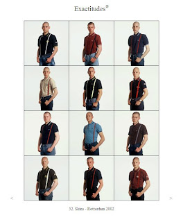
For 13 years Ari Versluis and Ellie Uttyenbroek have been documenting street fashion in cities around the world. Beginning in Rotterdam, they have now canvassed the street of London, Beijing, and Cape Verde among many others, and been featured in many magazine and galleries around the world. Their method, as you will soon see, is highly stylized, unique and beautiful. And unlike most of not all other street photography, it is very probing: it questions our notions of identity, uniformity, and culture. INFLUECE MAGAZINE has said their work is “a direct assault on the mythic formula that photography plus the street equals authenticity.”

INTERVIEW QUESTIONS:

1. When I look at the work, I think I can immediately understand your function Ari as photographer, I think that this is because, even in the age of Photoshop, we are conditioned to believe the camera does not lie. But your function Ellie, as a stylist is more curious – could you explain how much your work influences the final photograph?
Ellie’s role seems to be in initially identifying the subject matter for each series and recognizing fashion, body type and body language traits that define a group. Additionally she will make minor adjustments to these traits during photography to realize their uniformity more strongly. This does of course corrupt the documentary integrity of the work, but then they don’t claim to be objective documentary makers.

2. All the photographs express the concept of uniformity, but also differences within tight parameters. For example, Morrocies you have the subjects wearing street wear so similar it almost becomes a uniform, whereas in Combat I noticed that body types are perhaps more a uniform than anything else. Is the point of the project, to expose unexpected expressions of uniformity?
I think yes, that is the primary, albeit possibly subconscious, intent of their work. They did not say this in so many words, but I think it’s a reflection of their Dutch-ness – a desire to dryly critique an institution that expresses the idea of individuality by mockingly showing that it does the opposite.

3. How long does it take to assemble a complete 3 by 4 block? What this more difficult working outside of Rotterdam?
Each block or series takes a different amount of time depending on the availability of subjects and their willingness to come into the studio. So for slutty teenage self-obsessed girls its no problem, but its harder with Muslim women who need to ask permission from their patriarchs. One series, Morrocies, took almost a year to complete.

4. In many, if not most blocks, you get the feeling that you set up a photo studio on the street and invite people in as they walk past. But for others, such as Formers, which I notice features Li Edelkoort, it must be a different system, can you explain that?
Actually the majority of the work involves inviting people into their studio over an extended period of time. So the sense of “street” probably derives more from the fashion application than anything else, the studio backdrop being sufficiently neutral although somewhat artificially contrived.

5. In an interview with the Guardian English newspaper, you mention that you like to dress similar to those you are taking photographs of? Can I ask, isn’t this practically very difficult, and doesn’t this possibly put you in uncomfortable situations of looking like you belong but not in other contexts (like the way you speak?)
Sorry this was not addressed in their lecture so I don’t know how this is managed, other than to say that they are outspoken and direct like many Dutch people and probably don’t have any problem sparking up conversations with strangers.
6. In many articles about your work, the word “language” is used frequently, and of course the way we dress is a visual language, but it occurs to me that fashion does not function exactly like language – for example, language and accents are strongly related to geographic areas, where fashion has more of an ability to cross geographic borders and be contained by cultural, gender or age borders. Do you see the work you do as a kind of cartography, a mapping of these borders?
Ari and Ellie confessed early on in their lecture that they are not themselves prone to sociological analysis of their work. Which does mean that I cannot. So yes, I think their work does create a social cartography, an interesting one because it is so explicit. Fashion has always been used to distinguish social groups from one another, but the presentation of this critique usually relies on the single exemplary image, so by visual grouping Ari and Ellie make this critique immediately tangible.

Prepared and written by Guy Keulemans, M&H masters program, Design Academy Eindhoven.


Marjan Slob lecture